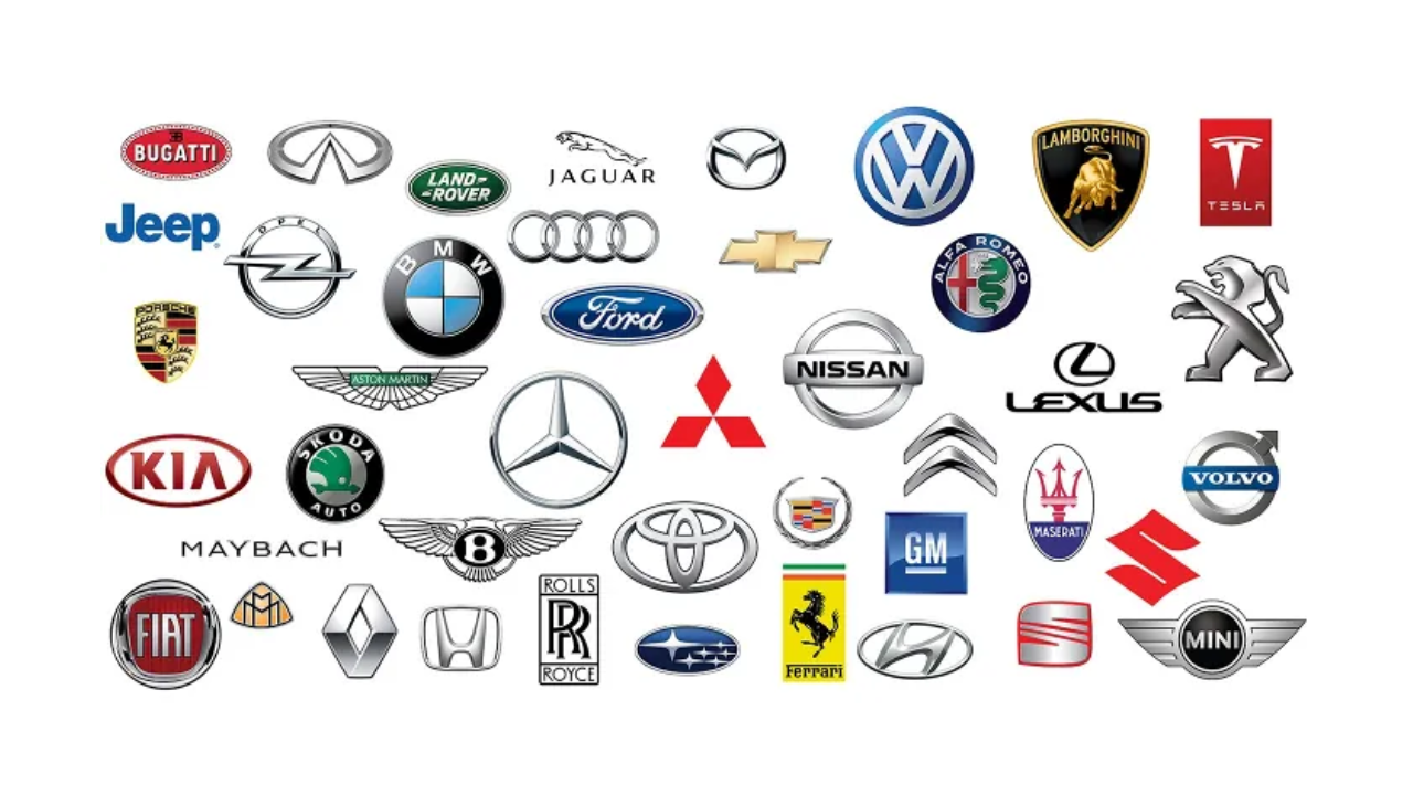
We often recognise a car before we see its name, sometimes just from a badge, a shape or even a silhouette. Iconic car logos are more than branding; they carry heritage, philosophy and often, a slice of history. From luxury marques like Rolls-Royce and Mercedes-Benz to the high-performance beasts of Ferrari and Lamborghini, each emblem tells a story far deeper than its polished chrome surface.
For car enthusiasts and collectors alike, these symbols are worth preserving, and thanks to advanced protective treatments, they can be maintained in pristine condition. It’s not just about preserving appearance; it’s about honouring craftsmanship and the stories these emblems represent.
Table of contents
- Why Car Logos Matter
- Rolls-Royce: The Spirit of Ecstasy
- Mercedes-Benz & The Silver Arrows
- Ferrari: The Prancing Horse
- Lamborghini: The Bull
- BMW: The Bavarian Roundel and a Common Misconception
- Audi: Four Rings, Four Histories
- Toyota: The Three Ellipses of Trust
- Tesla: The Electric Revolution
- Porsche: The Stuttgart Shield
- Rejected Car Logos: What Could Have Been
- Fun Facts & Myths About Car Logos
- Caring For Your Car Logos and Emblems
- Conclusion
Why Car Logos Matter
In the world of automobiles, logos are not mere designs; they’re legacies. From the instantly recognisable Mercedes star to the powerful bull of Lamborghini, these emblems capture the vision, values and legacy of their creators. They evoke emotion, establish identity and create trust.
Famous car brands don’t just make vehicles; they build reputations around these logos. That’s why even today, the unveiling of a new badge or minor logo tweak becomes global news. For many, the logo on the bonnet isn’t just a symbol of a car; it’s a personal statement.
These popular car logos have become so deeply embedded in our culture that we instantly associate them with specific qualities. A Mercedes star speaks of luxury and engineering excellence, while a Ferrari horse promises raw performance and Italian passion. This emotional connection is what makes these emblems truly powerful marketing tools.
Rolls-Royce: The Spirit of Ecstasy
Perhaps no logo in the automotive world is as revered as the Spirit of Ecstasy, more affectionately known as The Flying Lady. Sitting proudly atop every Rolls-Royce, this graceful figure was born in the early 20th century and has remained largely unchanged.
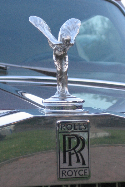
Designed by Charles Robinson Sykes in 1911 and modelled after Eleanor Thornton, the Spirit represents speed, elegance and silence, the very traits Rolls-Royce prides itself on. Her robe billows as if caught in the wind, and her posture leans forward, balanced and bold.
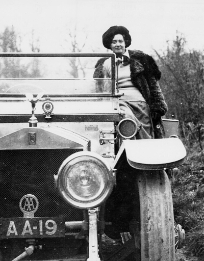
The story behind this emblem is quite romantic. Lord Montagu of Beaulieu commissioned Sykes to create a personal mascot for his Rolls-Royce, using his secretary and alleged lover Eleanor Thornton as the model. The original figure was called “The Whisper” and showed Thornton with her finger to her lips, symbolising their secret affair. When Rolls-Royce decided to create an official mascot for all their vehicles, Sykes adapted his design into the Spirit of Ecstasy we know today.
While today’s Flying Lady is often retractable and engineered with modern safety features, she still requires care. Professional car detailing ensures every groove and curve of this miniature sculpture remains dirt-free and gleaming.
Mercedes Benz & The Silver Arrow
The three-pointed star of Mercedes-Benz is one of the most recognisable symbols in automotive history. But it’s the story of the Silver Arrows that truly captures the racing heritage behind this emblem.
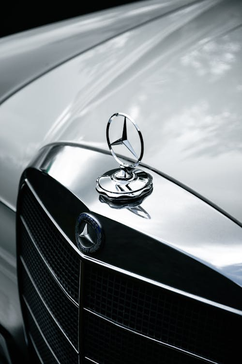
Created by Gottlieb Daimler in the 1880s, the three-pointed star was meant to symbolise the company’s ambition to dominate transportation on land, sea and air. Daimler had drawn this symbol on a postcard to his wife, writing that “one day this star will shine over our triumphant factories.”
The Silver Arrows legend began at the 1934 Nürburgring Grand Prix. Mercedes-Benz cars arrived at the race weighing one kilogram over the regulation limit. In a desperate overnight effort, the team stripped off the white paint from their cars, revealing the natural silver aluminium underneath. Not only did this solve the weight problem, but it also created the iconic silver finish that would become synonymous with Mercedes racing cars.
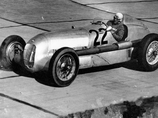
This racing heritage is why many Mercedes enthusiasts today choose to keep their star emblems in pristine condition, often using ceramic coating to protect the finish and maintain that mirror-like shine reminiscent of the original Silver Arrows.
Ferrari: The Prancing Horse
Ferrari’s prancing horse is arguably the most passionate logo in the automotive world. This black stallion on a yellow background carries with it a story of war, loss, and tribute that makes it deeply meaningful to Italian culture.
The emblem originally belonged to Count Francesco Baracca, Italy’s top fighter ace during World War I. Baracca painted this prancing horse on the fuselage of his aircraft, and it brought him luck through 34 aerial victories. When Baracca was shot down and killed in 1918, he became a national hero.
Years later, in 1923, Enzo Ferrari met Baracca’s mother, Countess Paolina, at a racing event. She suggested that Ferrari use her son’s horse symbol on his cars, saying it would bring him good fortune. Ferrari adopted the emblem but made one crucial change: he kept the horse black (as it was on Baracca’s plane) but placed it on a yellow background, representing the colours of Modena, Ferrari’s hometown. Enzo Ferrari used it first in 1932 on Scuderia Ferrari cars, and in 1947 on road cars.
This connection to Italian military history and regional pride makes the Ferrari horse more than just a logo – it’s a symbol of national identity and remembrance.
Lamborghini: The Bull
The story of Lamborghini’s bull is both personal and astrological. Ferruccio Lamborghini, the company’s founder, was born under the zodiac sign of Taurus, which is represented by the bull. But there’s more to this story than just astrology.
Lamborghini was a passionate fan of Spanish bullfighting and owned a ranch where he raised fighting bulls. The powerful, aggressive stance of the bull perfectly represented the character Lamborghini wanted his cars to embody – raw power, determination, and an unwillingness to back down from a fight.

Interestingly, this also tied into Lamborghini’s rivalry with Ferrari. While Ferrari’s horse represents grace and speed, Lamborghini’s bull symbolises brute force and power. This rivalry began when Lamborghini, originally a successful tractor manufacturer, complained to Enzo Ferrari about the clutch in his Ferrari 250 GT. Ferrari dismissively told him to stick to making tractors, which motivated Lamborghini to create his own sports car company.
The bull emblem has remained largely unchanged since the company’s founding in 1963, and many of Lamborghini’s most famous models are named after famous fighting bulls, including the Miura, Gallardo, and Huracán.
BMW: The Bavarian Roundel and a Common Misconception
BMW’s distinctive roundel is one of the most misunderstood logos in the automotive world. Many people believe it represents a spinning aircraft propeller, but this is actually a myth that has persisted for decades.
The truth is much simpler: BMW’s logo represents the flag of Bavaria, the German state where the company was founded. The blue and white quartered design comes directly from the Bavarian flag, with the colours reversed. The black outer ring was inherited from Rapp Motorenwerke, the aircraft engine company that BMW evolved from.
The propeller myth began in 1929 when BMW used an advertisement showing their logo superimposed over a spinning propeller. This was meant to highlight their aircraft engine business, but it accidentally created the misconception that the logo itself represented a propeller. BMW has repeatedly clarified this, but the myth continues to persist.
This logo has remained remarkably consistent throughout BMW’s history, with only minor refinements in typography and proportions. The roundel’s simplicity and strong geometric design have made it one of the most enduring symbols in automotive history.
Audi: Four Rings, Four Histories
Audi’s four interlocking rings tell a story of unity and collaboration in the German automotive industry. Each ring represents one of the four companies that merged in 1932 to form Auto Union AG: Audi, DKW, Horch, and Wanderer.
The merger was a response to the economic challenges of the Great Depression. By combining their resources and expertise, these four companies created one of Germany’s most successful automotive groups. The interlocking rings symbolise the strength that comes from unity – individually, each company might have struggled, but together they thrived.

August Horch founded both Horch and later Audi (after a legal dispute forced him to leave his original company). DKW started as a bicycle manufacturer before moving into motorcycles and cars. Wanderer also began with bicycles and motorcycles before entering the automotive market.
Today, Audi is part of the Volkswagen Group, but those four rings still represent the collaborative spirit that has driven the company’s success. The logo’s clean, modern design has made it equally at home on luxury sedans and cutting-edge electric vehicles.
Toyota: The Three Ellipses of Trust
Toyota’s logo might look simple, but it carries deep meaning about the company’s philosophy and values. The three overlapping ellipses represent the heart of the customer, the heart of the company, and the technological innovation that brings them together.
The inner ellipses form a ‘T’ for Toyota, while their overlap represents the mutually beneficial relationship between the company and its customers. The outer ellipse symbolises Toyota’s global reach and the world embracing their products.
There’s also a hidden connection to Toyota’s history as a textile manufacturer. Some interpret the inner ellipse as representing a needle with thread passing through it, referencing the company’s origins in the Toyota Automatic Loom Works.
The logo’s design incorporates elements of Japanese calligraphy, with varying line thickness that reflects traditional artistic principles. Even the empty space around the logo has meaning – it represents the values Toyota stands for: quality, innovation, integrity, and social responsibility.
Tesla: The Electric Revolution
Tesla’s logo marks a new era in automotive design – clean, minimalist, and deeply connected to the technology that powers their vehicles. While many assume the ‘T’ simply stands for Tesla, the reality is more sophisticated.
Elon Musk revealed that the logo actually represents a cross-section of an electric motor, specifically inspired by the original AC motor design by Nikola Tesla, the company’s namesake. The top curve represents the stator (the stationary part of the motor), while the vertical line represents the rotor (the rotating part).

This technical inspiration reflects Tesla’s approach to car design – everything serves a purpose, and form follows function. The logo’s simplicity also works perfectly in the digital age, looking equally good on a car’s bonnet, a smartphone screen, or a website.
Tesla’s logo represents the future of automotive branding – moving away from traditional heraldic symbols and embracing clean, technology-focused design that speaks to a new generation of car buyers.
Porsche: The Stuttgart Shield
Porsche’s logo is a masterpiece of heraldic design that pays homage to the company’s roots in Stuttgart, Germany. The crest combines elements from both the city of Stuttgart and the state of Württemberg, creating a logo rich in regional pride and historical significance.
The black horse in the centre represents Stuttgart, whose name comes from “Stutengarten,” meaning “mare’s garden.” The city was originally founded as a stud farm in the 10th century. The red and black stripes with antlers represent the coat of arms of Württemberg, the former German state where Stuttgart is located.
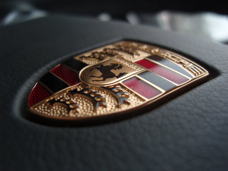
Franz Xaver Reimspiess designed the logo in 1952, and it has remained largely unchanged since then. The only major update came in 2023 when Porsche unveiled a more three-dimensional version of the crest, adding depth and modern appeal while maintaining the classic design elements.
In 2023, as part of its 75th anniversary, Porsche refreshed its logo with subtle colour changes, streamlined lettering, enhanced its three-dimensional appearance and a honeycomb pattern was added to the red sections of the logo. This new logo with sharper elements and modern detailing appeared on the 2023 Porsche Panamera first.
This logo perfectly captures Porsche’s identity – rooted in German tradition but always looking forward to the future. The horse symbolises power and grace, qualities that define every Porsche vehicle.
Rejected Car Logos: What Could Have Been
Not every iconic logo we see today was the first choice. Many famous car brands went through several design iterations before settling on their current emblems, and some of the rejected designs tell fascinating stories.
Ford’s Blue Oval wasn’t always oval-shaped. Early designs included elaborate scripts and decorative elements that were eventually simplified for better recognition. Henry Ford himself preferred simplicity, leading to the clean design we know today.
Volkswagen’s logo faced unique challenges during World War II. The original design featured a Nazi swastika, which was obviously abandoned after the war. The clean, simple VW design emerged as part of the company’s post-war rebranding efforts.
Mercedes-Benz experimented with various three-pointed star designs before settling on their current version. Some early proposals included elaborate decorative elements that were deemed too complex for practical use on vehicles.
These rejected designs remind us that creating an iconic logo is often a process of elimination – removing unnecessary elements until only the essential meaning remains.
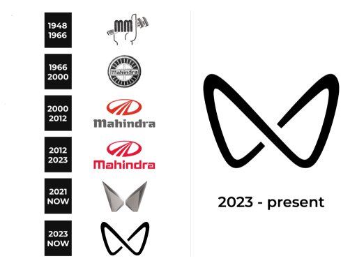
Mahindra’s Evolution: Mahindra’s logo has evolved from a simple “M” to its current stylised twin peaks, symbolising growth and ambition. Several alternative designs were explored internally before the final mark was chosen.
Fun Facts & Myths About Car Logos
Popular car logos are full of surprising facts and persistent myths that even car enthusiasts often get wrong.
- The Subaru Connection: Subaru’s logo features the Pleiades star cluster, which is called “Subaru” in Japanese. The six stars represent the six companies that merged to form Fuji Heavy Industries, Subaru’s parent company.
- Peugeot’s Long History: Peugeot’s lion logo predates their car manufacturing by decades. The logo was originally used on the company’s saw blades and other metal products, representing the strength and sharpness of their tools.
- The Mitsubishi Diamonds: Mitsubishi’s three-diamond logo comes from the Japanese words “mitsu” (three) and “hishi” (water chestnut, which has a diamond shape). The logo represents the three-leaf crest of the Tosa clan and the three-diamond crest of the Iwasaki family.
- Volvo’s Iron Symbol: Volvo’s logo uses the ancient symbol for iron, representing strength and durability. The diagonal line across the grille wasn’t originally part of the logo – it was added to hold the badge in place, but became so iconic that it’s now considered part of the design.
Caring For Your Car Logos and Emblems
Ceramic coating offers a level of protection, creating a hard, hydrophobic surface that repels water and contaminants. This treatment can be applied to both painted and metal emblems, making them easier to clean and maintain their appearance for years. Another option is to install paint protection film over the logo.
Many professional car detailing services offer treatments that can restore faded or damaged logos. These treatments can often bring back the original lustre to oxidised chrome or refresh faded paint, making old emblems look new again.
Chrome pitting is the most serious; small holes develop in chrome plating over time. Once pitting begins, it’s difficult to repair and usually requires emblem replacement. Prevent chrome pitting by keeping emblems clean and dry. For painted emblems, UV damage is the primary concern. Prolonged sun exposure can cause colours to fade and clear coats to peel. Regular waxing or ceramic coating can provide UV protection and maintain colour vibrancy.
Conclusion
Car logos aren’t just decorative; they’re cultural artefacts, steeped in legacy and meaning. Whether it’s the poised elegance of the Spirit of Ecstasy, the raw aggression of a charging bull or the proud history behind four simple rings, these emblems are milestones of automotive identity.
By understanding their stories, we connect more deeply to the machines we drive. And by preserving them with care and craftsmanship, we honour that legacy, with the support of trusted specialists like CarzSpa, who treat every emblem like a piece of motoring art.
Share: